Showing posts with label Children's Illustration. Show all posts

Saturday, March 6, 2010

Wednesday, January 13, 2010

Were-Rabbit® Buns…

I just made these for fun. They are modeled after the bunnies from Wallace and Gromit and the Curse of the Were-Rabbit. They are by no means identical, nor did I design them in any way. I just think they're really cute and gave me some good practice with the sculpey clay.

On that note, I'm finding the sculpey to be a bit difficult to work with, mostly because it is so soft, it wants to collapse. I had great difficulty with the mouth area and had to modify it to be a simple opening with teeth. I also ended up breaking one of the ears off of the gray bunny and had to Frankenstein it back together.


Ahhh! Big kitties!


Wednesday, January 6, 2010

Polar Bears…

I've been playing around with some other illustration techniques—mainly creating 3D sculptures and photographing them. This is my first attempt and was supposed to be this year's Christmas Card. *cough* They didn't quite get done. I wasn't happy with any of the photographs and need to make myself a portable photographers studio to get the lighting to come out better.

I made the bears out of sculpey clay then added eyes with a sharpie and nose and foot detail with powdered graphite. I then burnished that with a hog's hair bright to "set" the graphite. I tried photographing on a piece of glass over blue paper. I think I would have preferred to use the flaked snow in the background as opposed to the blanket of snow…


The lighting differences all have to do with the way I'm setting the white balance. I try a number of different settings and focus on different areas. Well, maybe this will be next year's Christmas card.


Tuesday, January 5, 2010

What’s New This Week…

Just finished up a book on undersea adventures for a local client. Here are some of the internal pages. The project was done in Adobe Illustrator and stared out with pencil sketches on copy paper.


Friday, October 2, 2009

New Children’s Illustration…

This is another project for the same product line. This piece is all about discovery in your back yard. Not my back yard though—mine's all gravel, what with living in the desert—but it's the backyard I remember from growing up in Colorado. This family lives in my favorite style of house—the Craftsman Bungalow.

I made a number of illustration style evolutions in this piece. Most notably, the texture to the trees. it's something I've wanted to implement for a while now, and this seemed the perfect place to do it. I'd started to put in texture like this working on the Charlie the Choo-Choo books. The leaf shapes were inspired by the sky designs as seen in Spongebob Sqaure Pants. Yes, I watch that show. I was a little worried about the overall crazy-business of the piece, but my client said "bright, bright, bright," and are even adding more color to their packaging. Whew! A bit of color overload, so I kept the palette tighter with a complimentary (red-green) color scheme. I also added some of my signature smoke, as found in the Charlie the Choo-Choo series of children's books.

Detail of the image.

New Children’s Illustration…

An illustration for a local game company for one of their new projects. This piece was created in Adobe Illustrator. It focuses on small town environments and what you might see along an afternoon walk. Though honestly, I'd love to see the town that has buildings this fun.


Detail of the drawing. If you've ever had the opportunity
to feed a giraffe, you will recognize their long tongues.

Monday, August 3, 2009

You Win Some, You Lose Some…


A number of months ago I was asked to present some sketches and rough concepts for a children's book by an author in Yuma Arizona. Ultimately, they went with another illustrator, but I wanted to show my concepts for the artwork. I presented a number of different characters for the author to choose from and then worked up one in full-color. I went very Photoshopy, though I've moved away from that style in most of my work now. It's too fussy and very time intensive. I prefer the illustrator look to my newer art now.

When I first started out as an illustrator, I would get frustrated with myself for not getting the job. Did I not draw it right, was I not quick enough, was the color wrong? The only thing I can say, is this is how I draw and work and I'm constantly trying to hone my illustration skills so that you immediately know it's a Kerrie Robertson illustration. I am so very far from being there! So, these are the fireflys I presented.


After refining some of the characters I presented this turnaround to show how the firefly would look in different poses and angles.


I also worked up some page thumbnails to show how I would lay out the story.

Tuesday, July 28, 2009

Evolution of An Illustration

A few months ago I had the pleasure of working on video game art for a local company. There are 6 games in total, and today I feature the work on Robot Rock! Starting with loose sketches I explored numerous shapes of robots, some inspired by everyday household objects.


Next, I worked up a background and drew up one of the robots to near completion to see how it would interact. I wanted a really dramatic background, but when in color, it would be quite minimal. Does that make sense?


The developer wanted kids to be able to choose a “girl” or a “boy” robot, so here they are:


And here's the final layout:


If you're interested in playing the games, check them out here: Pima Public Library.

Friday, February 13, 2009

Monday Artday…

This is my contribution for “Cliff Hanger.”

Thursday, February 12, 2009

Sketches and Doodles…


I’ve been trying to work out some new characters of a cat and realized that I am terrible at drawing cats. So, I took some time today to work out these little guys.

Monday, December 8, 2008

What’s New This Week…

Here is the final version of an image created for MasterPieces Puzzle Co. This product should hit store shelves this spring. I just love the new look they are going with. Very fresh, clean and simple. Very not “mass-market.”


A few of the animals were done by the very talented Megann Colan.

An edit to a previous post

A few weeks ago I posted about my work style and just wanted to post the final version of the Pirates Page for my latest children’s book illustrations.


All illustrations are completed in Adobe PhotoShop and then brought together with the text in InDesign.

Monday, November 24, 2008

What’s New This Week…

This week I’m wrapping up a really cute little product for MasterPieces Puzzles. It’s using a style that I developed for them a few months ago. We decided that a simple “cut-paper” look would be best for quickness and ease. Here are a few of the sketches prior to the finished piece.

Sea Otters:


Turtles:

Friday, November 21, 2008

“Going On a Train”


My first children’s book is published and printed, CDs are done and it’s ready for sale here « Music Speaks Publishing ».

It was printed locally by Skyline Printing and they did an excellent job. Great color, great binding and quality work all the way. This was definitely a learning experience for me as I am well into my second children’s book. I’m learning how to judge my time a little better as far as the illustrations go, and I’ve also learned to trust your own judgment. If an image isn’t working there is no sense in not just scrapping it and starting over. I did this on two of the spreads in the book and I’m very glad that I did that.

The finished book looks great and I hope that I can work with Pamela in the future on more projects.

Monday, November 3, 2008

Illustration Style: Step by Step

Today I’m working on coloring pages for a new Children’s Book. As I was working I thought it might be interesting to see the numerous steps that I take to achieve the finished result. Every illustrator works differently, and each one has their own techniques, but here are mine:

STEP 1: I use a blue colored pencil (not the non-repro blue; I find the pencil to hard to draw with as the lead is very dense) to draw in my line-work to work out the shapes and style. I then go over this with an HB graphite pencil and scan in the image. In my case, I don’t actually have a scanner, so I take a macro-shot with my digital camera and import this into PhotoShop to clean up. (A scanner is high up on my wish list!) Sometimes, I might rearrange elements in PhotoShop that I didn’t think were working as well as possible in the original sketch.
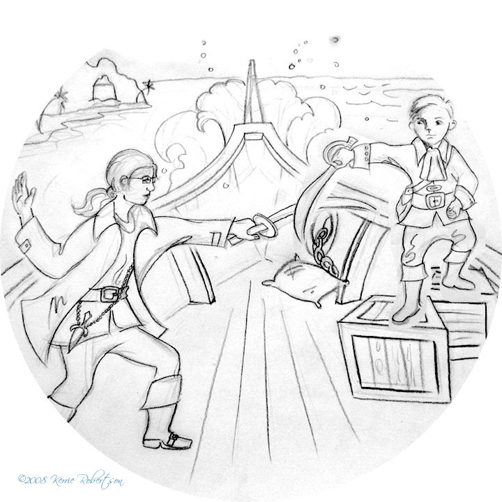


STEP 2
: I open my sketch in Adobe Illustrator and with a personalized brush that I have created, go over my sketch and create linework. I make subtle changes to the style and shapes to help refine the sketch.
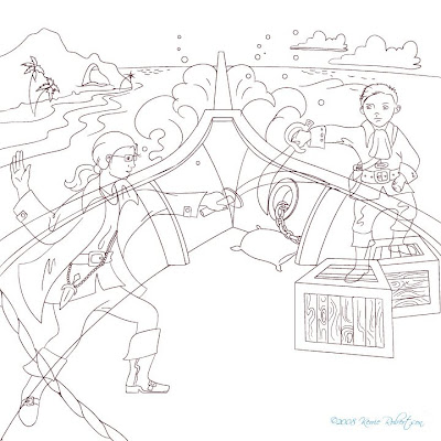


STEP 3
: I add the color and refine the pallette in Adobe Illustrator. They have a tool called Live Paint Bucket, which is essential do doing these drawings quickly. Thank you Adobe! Here is where I start to notice little things that annoy me, like the girls sword tip lining up exactly on the edge of the ship – or tangent to this line. There’s also a few other areas and of course the rope needs to be brought in front of the girl, not under her leg to trip her.


STEP 4: I bring all of my layers into Adobe PhotoShop and start painting using a custom brush that I made. I want this to look like it was created in pastels, so it has a bit of a rough edge to it. This file is only 80% done at this point, however I’ll update it when it’s complete.

Monday, October 6, 2008

What’s New This Week!

I'm currently working on illustrations for another children's book. These are all just preliminary pencil drawings waiting approval to go into the color stage. I haven't yet worked out the way I'm going to color it though – watercolor, pastels, or acrylic. I'll be playing with that later this week.


I'm playing with the expression on the teachers face. She's supposed to look surprised/confused at what the little boy tells her he did for the weekend.